


Create a campaign to get more listeners for BBC Radio 3 by appealing to it’s elitist credentials.
Advertising Project

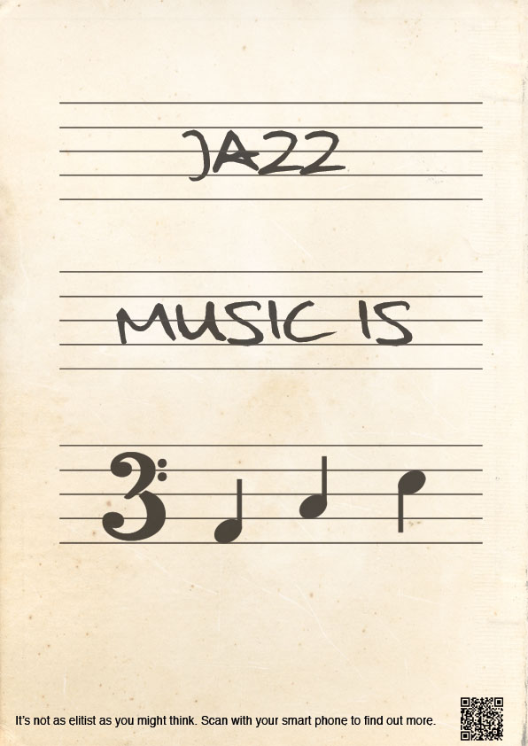
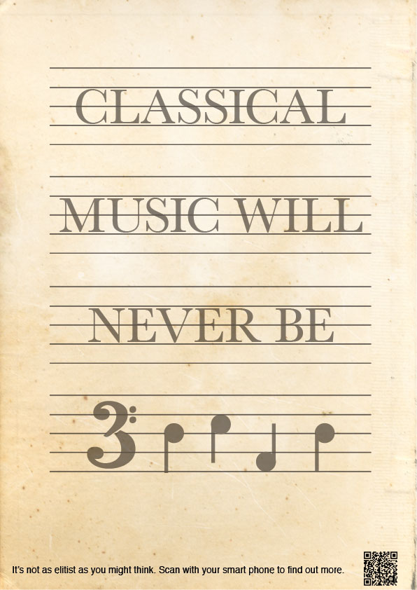
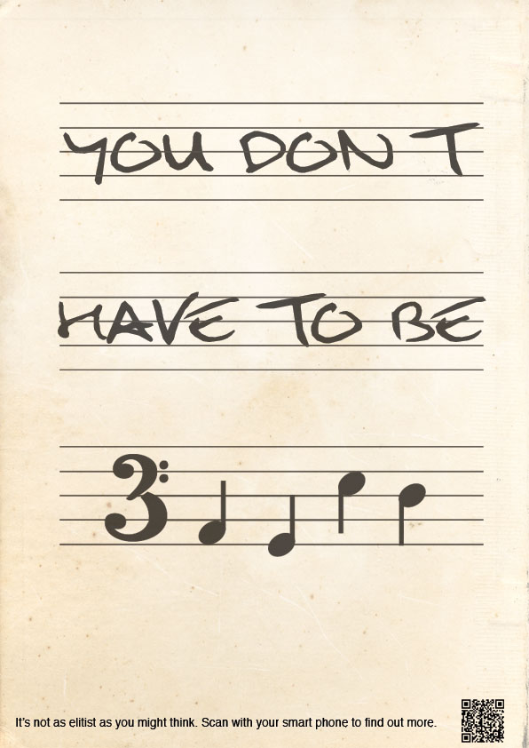
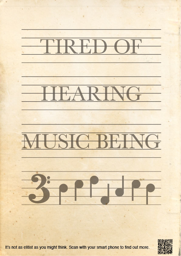
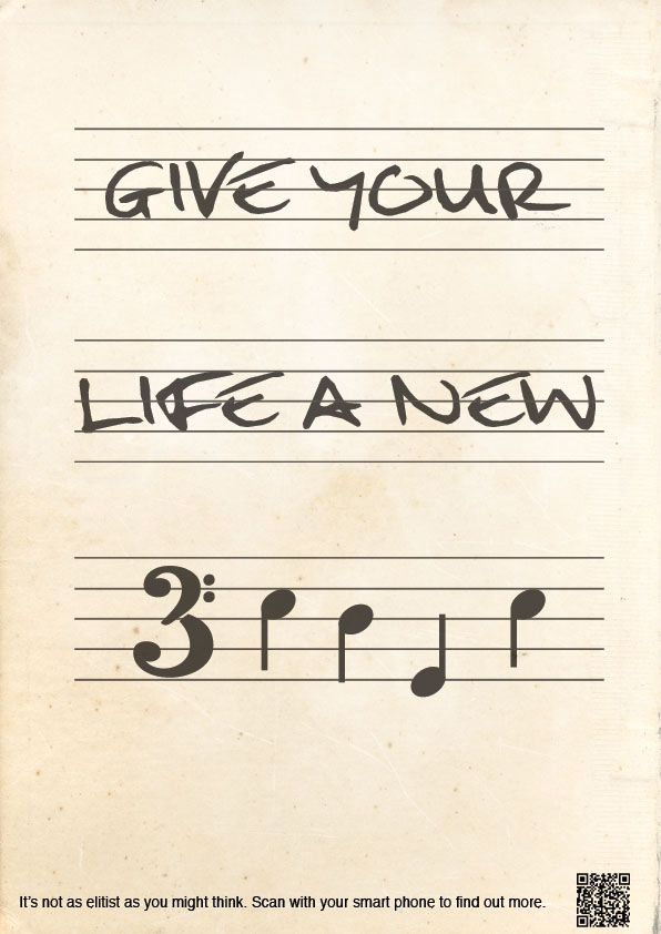

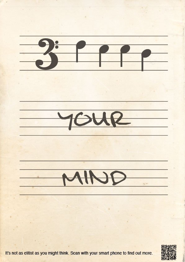
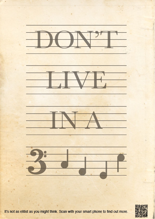
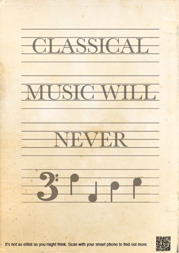
My Radio 3 campaign is made up of eight posters and Spotify adverts linked to each of the posters. The posters use musical notes to make up words. Four of the posters are done in the style of jazz sheet music and the other four in the style of classical sheet music. The idea is that some people ‘elitist’ or not will be able to read the word made from notes and figure out what the sentence says. Some people will notice the radio 3 logo placed subtly in black (not red) on the stave with the notes.However most people won’t know what is meant by the notes and will be intrigued to find out what the poster is trying to tell them, especially as there are eight of them and they would see them around on a daily basis quite a lot, all saying different things.
There is the same sentence at the bottom of each poster saying ‘It’s not as elitist as you might think. Scan with your smart phone to find out more’. Next to this there is a QR bar code with can be scanned by most up to date phones which takes you to a website labelling each note with the letter so the consumer can figure out what the notes say. QR codes are quite anew thing and it’s mostly the younger generation (ie. Non-radio 3 listeners as the average listener is 57) which will scan it. I often scan QR codes when I see them even if I am not interested in what they show and after speaking to my peers they said they also do the same. So the overall idea is to get people intrigued and interested. It’s basically saying if you want to know then you can! You don’t need to be posh or musical or even be an avid radio 3 listener. Radio 3 is a ‘group’ that anyone can join so why not give it a try.
The classical posters all use Baskerville as their font as this is the font used on classical music scores.The notes are clean cut and more rounded (than the jazz notes) and the texture over the top has a higher opacity to make it look like an old classical music score.
The jazz posters all use a handwriting style font, as this is how the writing is on most jazz scores. It’s handwritten a little scribbly and a lot freer than classical scores, much like the music. The texture has a lower opacity so it still looks a little old but not as old as the classical ones. The notes are more oval shaped as if also handwritten.
